IBM Design Language
2018 — 2019
IBM’s Design ethos advocates for partnerships and embraces dualities: Mankind and machine. Fixed and flexible. Natural and engineered. And now...IBM and BUCK. Together with the IBM Design Team, we’ve produced an ongoing series of shorts that demonstrate the use, usefulness, and deeper thinking behind elements of their new design language.


Think → Guide
In direct partnership with the IBM Design team, we worked to capture the essence of IBM’s principles, approach, and expression of elements. Bringing them to life in a way that not only demonstrates their use, but reveals the inherent reasoning, thought, and interconnectedness present in each. We scripted, designed, and animated these episodes with rigorous adherence to their system. In exploring the deeper connections between IBM’s ideology and the tools and elements it generates, we instilled our own learnings and insights back into the process to create visuals and a tone of animation distinctly IBM. Each short simultaneously illustrates and embodies IBM’s Design Language, becoming a medium between principle and practice.
2x Grid ↓
An underlying framework →
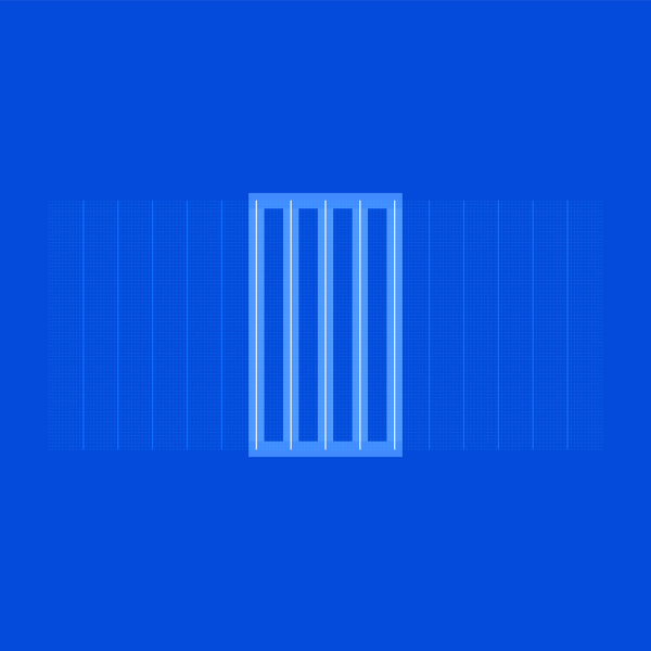
Foundational to their system, the 2x Grid provides structure and guidance for all of their creative decision-making. The core concept of the 2x Grid is to divide or multiply by two, forming a visual rhythm and foundation on which to work. With something so fundamental to IBM’s identity, our challenge was to communicate the usefulness of the 2x Grid as a tool, but also as the expression of an essential idea.
Plex ↓
A reflection of brand spirit →
More than just a typeface, Plex is just as important to IBM as their name or logo. Inspired by their history, we explored the rich detail that went into Plex’s development, its impressive breadth and adaptability, and its global nature with support for over 100 languages.
Philosophy ↓
Design is how we build bonds →
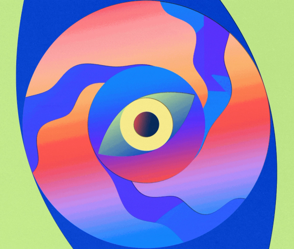
IBM is built on big ideas. Our duty was to make them seen and felt. Employing finely engineered visual metaphors and evocative animations, we made their ideas visible and tangible.
Color UI ↓
Blue at the core →
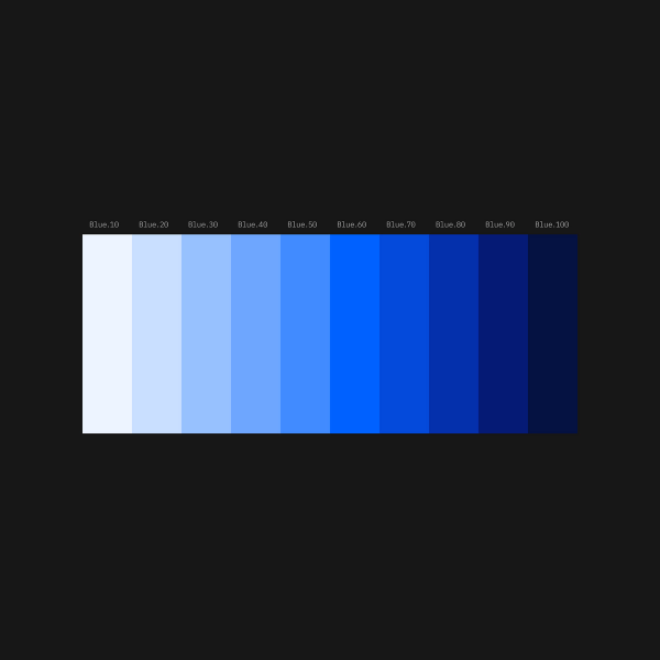
More than just blue (but also, definitely blue), IBM’s new palette is broad, diverse, and purposeful. Our challenge was to introduce the new palette in all its breadth and beauty, before demonstrating its unique versatility, accessibility, the vital role its guidance provides within interfaces, and blues lingering presence in all things.
Motion ↓
Productive, Expressive →
Dualities come to the fore in IBM’s approach to motion. We examine the two fundamental motion types: Expressive and Productive. More than just predefined curves, they are calculated in their use and emotional in their intent. This contrast enriches the experience whenever something moves.
Grid UI ↓
Fixed & Flexible →
In interfaces and on screens, the 2x Grid continues to be the framework for everything IBM designs. In this installment, we concentrate on how one predefined unit, when used in multiples of two, defines the creation and use of a 2x Grid that functions seamlessly across an ever-changing sea of ratios and formats.
Icons ↓
Ideas, objects, and actions →
Icons are integral to how IBM communicates. Living outside language, they communicate at a glance, afford interactivity, and draw attention to important information. Sharing many of the same details as Plex, IBM’s icons are designed to a strict standard. We scrutinize the engineering that goes into their designs to ensure that they sit harmoniously within the broader design ecosystem, and provide clarity and accuracy.
Coming soon!
